How-to Guides
We have several guides to help us manage the UNC Eshelman School of Pharmacy brand.
Adherence to these guidelines will help to present our brand consistently and speak with one brand voice.
- What is a brand
- The role of brand strategy
- How we define our brand
- How we design our brand
- How we manage our brand
Adherence to these guidelines will help to present our brand consistently and speak with one brand voice.
This guide describes the elements of the UNC Eshelman School of Pharmacy visual branding style, which represents the implementation of the brand identity for the School.
Following these guidelines helps maintain consistency and recognition of the brand. All materials that are created by school representatives should adhere to these guidelines to ensure there is always a single, standard usage that reflects the School’s brand promise and brand voice.
If you have questions about using these elements, please submit a MarCom request for brand assistance.
Brand Identity Guide
UNC’s visual identity is managed by UNC Creative. The design standards (size, spacing, color, etc.) that apply to the School logo are the same as those that apply to the University logo.
Usage
- Always use the original, high-resolution digital artwork that is available for download on our resources page.
- As the primary graphic identity for our School, the logo must appear on all communications, including brochures, stationery, business cards and websites.
- The logo may not be reconstructed or altered in any way.
- Do not create secondary logos, as this is not permitted and it dilutes our goal of creating a common, mutually reinforced brand.
Clear Space Requirement
- To ensure the integrity and visual impact of the logo, the appropriate “clear space” must be maintained on all sides. There should always be 1/2 the distance “x” between any part of the logo and any other page element or the edge of the page, where “x” is equal to the height of the well.
Size Requirement
The logo must be resized proportionally and as a group (logomark, divider rule and logotype); therefore, measurements for all elements in the logo are relative to each other.
- When PMS® 542 or black is used in printing of the logo, the minimum size for the logo is 1.875 inches wide.
- When the logo appears as a white knockout on a color, the minimum size is 2 inches wide.
- If a publication is using a 4 process color build in the printing of the logo, the minimum size is 2 inches wide.
Examples:
Horizontal
![]()
Vertical
![]()
Logo Colors
School and unit logos are available in Carolina Blue, black and white. No other color may be created.
Examples:
![]()
Logo with Scientific Pattern
When using the scientific pattern background with the logo, it should never go above 25% opacity. The pattern should also have a layer mask that fades the pattern from the bottom to the top.
Example:
![]()
The promise should always be displayed using Whitney Medium Italic.
As a general rule do not place the brand tagline directly under the logo. Be sure to maintain required spacing. It is not part of the logo and this placement creates the impression that it is.
Example:

Tagline with Logo
To ensure the integrity and visual impact of the logo, the appropriate “clear space” must be maintained on all sides. There should always be a distance equating to 1/2 the height of the Old Well between any part of the logo and tagline
The tagline should always be centered with the logo.
The tagline should be the same color as the logo
Example:
![]()
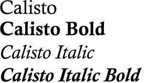
The headline design font for the UNC Eshelman School of Pharmacy is Quarto. Quarto is a fresh, modern, and optimistic typeface, making it an excellent choice for headlines in both print and digital. Quarto is not meant to be used below 11 pt, and pairs well with Whitney.
If you do not have access to Quarto, we suggest using Calisto in its place.
Examples:
Quarto

Calisto
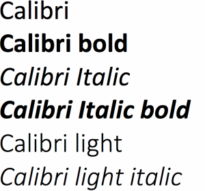
Whitney is used our design font for secondary headlines and body copy. Whitney is a warm, refined sans serif that pairs well with Quarto. It works well for body copy and in larger headline sizes.
If you do not have access to Whitney, we suggest using Calibri in its place.
Examples:
Whitney
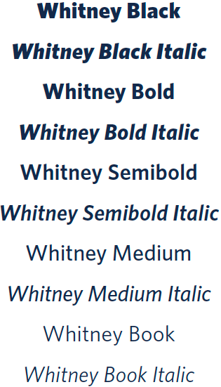
Calibri
and sophistication. The brand colors utilize the university’s existing palette but includes secondary colors in order to provide variety.
The color palette for print application is slightly different than digital in order to ensure the best reproduction. Use PMS or CMYK values for print projects and HEX and RGB values for digital projects.
Colors outside of the approved palette are not allowed.
Brand Colors:
Primary:
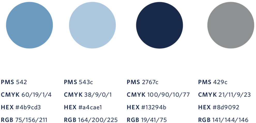
Secondary:

Argyle X
This argyle X is meant to highlight areas of precision and expertise in a graphic way. It can be paired with photography, allowing the viewer to focus on certain areas within the overall composition. It also functions as a visual cue to highlight areas of copy. The scientific line elements are another graphic element essential to the UNC Eshelman School of Pharmacy look and feel. The line work can also used to activate imagery by weaving it in with photography.
Examples:
Single

Horizontal Pattern

Vertical Pattern

Scientific Lines
Scientific lines and circles are a graphic motif that symbolizes molecular structure.
Example:

Microscopic Pattern
The microscopic pattern is used to provide background contrast and visual interest to graphic compositions.
Example:

The school or unit logo should be used as the primary mark in branded materials.
These logo marks should only be used selectively as a secondary design element to reinforce our brand identity and our connection to UNC.
These logo marks may only be used if the formal school or unit logo appears elsewhere.
Examples:
![]()
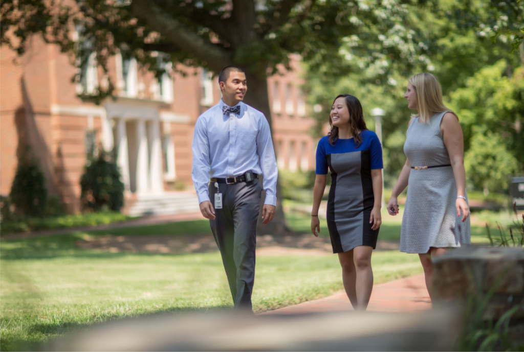
Color photography is used to showcase the real world impact of the UNC Eshelman School of Pharmacy, and our brand tone of “humanity.” To help accomplish this, our photography should focus on people (with an emphasis on faces and eyes), human interaction, peak moments, daily activities, key events, guest speakers, and whenever possible it should include the patients we serve.
When pairing photography with intricate line work and bold typography, it is important that all of these elements work together harmoniously. School representatives who have a need for this intricate styling should submit a MarCom request for brand assistance.
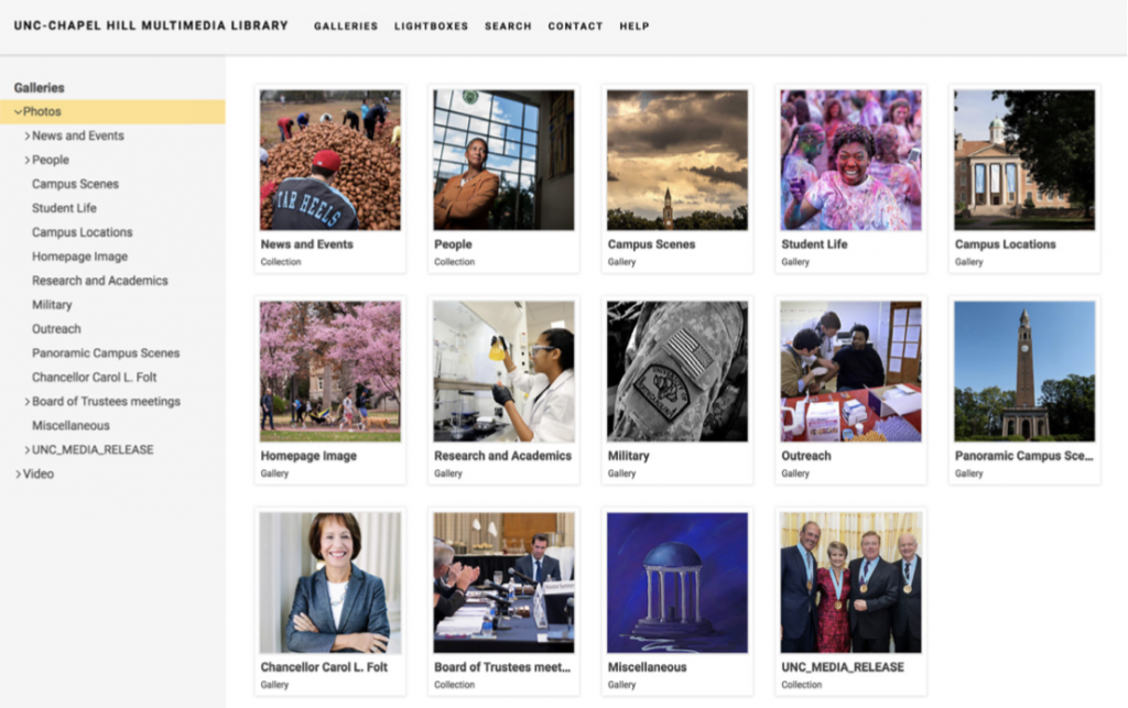
The UNC Eshelman School of Pharmacy has an online photo archive hosted on the website Photoshelter that is available to school representatives for use in presentations, teaching and for marketing materials.
The University maintains a collection of images and video on the website Photoshelter that can be downloaded and used by faculty and staff.
Visit http://unc.photoshelter.com/ to sign up for a free account and use this content.
Example:
Building Signs
Banners and signs that will be visible from the front of the school must go through an approval process. The requested sign must be approved for hanging, then the design must be created or approved by the Marketing and Communications Office. Our facilities team are the only personnel allowed to hang signs on the exterior of the building.
Signs hung in Kerr Lobby and inside our buildings
Any signage that is larger that 8.5 inches by 11 inches must be approved by the Marketing and Communications Office. This does not include academic poster presentations created by students and/or faculty.
Example:
Brand Promise:
Advancing medicine for life
Communicates that not only are we innovating in our classrooms research facilities and practice settings to improve human health, but we are also pushing the boundaries of pharmacy and drug research with an endless commitment.
Messaging Themes
To convey the appropriate voice and support the brand, the School has developed four messaging themes. The themes and their descriptions are not to be directly used when writing copy but rather as guidance for messaging.
Research
Education
Practice
Innovation
Tone Words
The messaging strategy is complemented with tone words that reflect the brand’s personality. These words should be used as a guide when drafting marketing copy or ideas, but do not need to be explicitly used within the copy.
GENUINE: Warm, Friendly, Authentic, True
WITH HEART: Deep awareness of other people’s needs, caring, embraceful, compassionate
INSPIRED: Of extraordinary quality as if arising from some external creative impulse
PROGRESSIVE: Constant innovation, diverse, energetic, multifaceted, ever-evolving
RELENTLESS: Determined, fierce, uncompromising, rigorous, unrelenting in our pursuits
VISIONARY: Pioneer, creator, trailblazer, ambitious for the common good, forward thinking, bold
LEADER: Out in front, advancing thought and practice, intellectual
TRUSTED: Dependable, reliable, credible, established
The UNC Eshelman School of Pharmacy follows the Associated Press Stylebook in matters of writing style, punctuation and usage. AP style is the official and primary style used by the University; however, there are exceptions. You can view those exceptions here. Merriam-Webster’s Collegiate Dictionary Eleventh Edition is the authority on spelling, capitalization and hyphenation unless superseded by AP. The Chicago Manual of Style Sixteenth Edition is used a the guide for situations not covered by AP. The change to AP style was made in the summer of 2015. Most content and publications produced before then follow Chicago style.
It is for the sake of readers that the we advocate using a clear, consistent, contemporary style of writing in every nonacademic document or publication that comes out of the UNC Eshelman School of Pharmacy. Our style guide is a tool to help us do this.
The following is a much-abbreviated guide to style and usage covering topics that often crop up at the UNC Eshelman School of Pharmacy. Use this style guide and the references listed below to help you achieve clear, professional writing and communication. The School used Chicago style until 2015, when the University made AP the official style for most communications.
Last updated March 6, 2023.
This is a work in progress. If you have questions about style, grammar or usage, contact Jeni Cook at 919-966-1070 or jeni.cook@unc.edu.
academic degrees: Capitalize formal degree names (Doctor of Pharmacy, Master of Public Health, but master’s degree). Abbreviate with periods (B.S., Pharm.D., Ph.D.) and set off from a name with commas. To avoid turning sentences into alphabet soup, limit yourself to two advanced degrees after a person’s name in running text. In most cases, only include terminal or professional degrees. (e.g. Alex Tropsha, Ph.D.; Kim Brouwer, Pharm.D., Ph.D.). Do not put a bachelor’s degree after a name. Do not include professional licenses or certifications (R.Ph., B.C.C.P.) with academic degrees.
adviser: This is the preferred spelling.
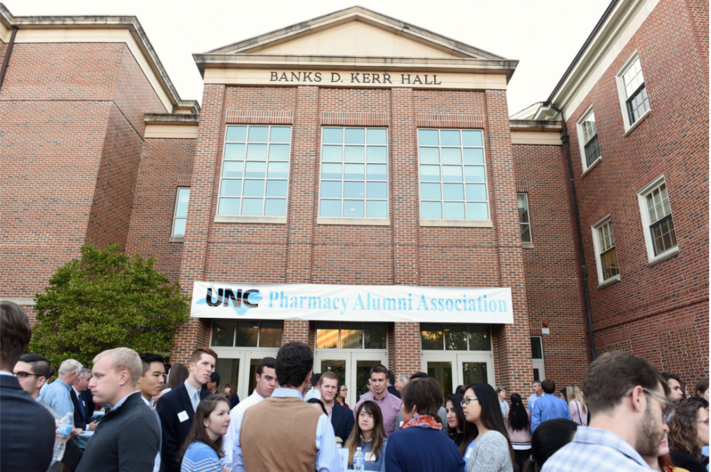
alumni association: UNC Eshelman School of Pharmacy Alumni Association, formerly the UNC Pharmacy Alumni Association. The name changed in 2014. Use the full name on first reference and pharmacy alumni association or alumni association on subsequent references. Do not abbreviate.
ampersand (&): Don’t use ampersands unless they are part of a company name (Proctor & Gamble).
and/or: Don’t use this awkward construction. It’s almost always one or the other (usually and).
backslash (/): Don’t use backslash as a substitute for a proper conjunction (and, or).
B.S.Pharm.: a bachelor’s degree in pharmacy.
Beard Hall: Named for John Grover Beard, the second dean of the pharmacy school.
capitalization: In general, only proper nouns are capitalized. Proper nouns are the unique names of individual people, places, and things. As an exception to capitalization rules, we capitalize School and Pharmacy when used to refer to the UNC Eshelman School of Pharmacy and University when it refers to the University of North Carolina at Chapel Hill. Job titles, whether formal or informal, are not capitalized unless the title is used as part of a person’s name, and they are addressed using the title. (The dean of the UNC Eshelman School of Pharmacy is Bob Blouin. The committee reports to Dean Blouin.)
capitalization of titles of works: There are very specific rules governing capitalization of the titles of publications, articles, seminars, and presentations. For simplicity’s sake, capitalize all words in a title except articles (a, the), prepositions (of, in, about), and conjunctions (and, or, but, because). See 8.167 of the Chicago Manual of Style for a more thorough treatment of the subject.
Carolina: Acceptable to use in reference to the University of North Carolina at Chapel Hill as long as the full name of the University is clearly used in first reference in a document or publication.
Carolina blue: PMS 542 is the blue to use for all print applications. For the Web, the color is #4B9CD3 (RGB 75, 156, 211). Please refer to the University’s color guidelines for more information.
PMS 542 Equivalencies in Other Color Models
CMYK C 60 M 19 Y 1 K 4
RGB R 123 G 175 B 212
HSB H 212 S 46 B 82
Carolina Partnership: An $18 million fund created by Fred Eshelman and the University Cancer Research Fund to support the Schools research centers
centers and institutes: There are two types of research centers at UNC: those housed within schools and those that stand alone within the University. All of the centers associated with the School of Pharmacy are housed within the School. For this reason, they should not be referred to as a UNC center in running text. The affiliation with the UNC Eshelman School of Pharmacy should be made clear whenever possible.
Eshelman Institute for Innovation, the Eshelman Institute, the institute
Center for Pharmacogenomics and Individualized Therapy, CPIT, the center
Center for Nanotechnology in Drug Delivery, CNDD, the center
Center for Integrative Chemical Biology and Drug Discovery, CICBDD, the center
Center for Nanotechnology and Drug Delivery, CNDD, the center
Center for Medication Optimization through Practice and Policy, CMOPP, the center
Center for Innovative Pharmacy Education and Research, CIPhER, the center
Institute for Drug Safety Sciences, IDSS, the institute
SGC@UNC
UNC Catalyst
courtesy titles: In general, courtesy or social titles (Dr., Mr., Mrs., Miss, Ms.) are not used in an anything other than personal correspondence (unless you write for the Wall Street Journal). To avoid confusing readers, the School does not use Dr. or professor as courtesy titles, preferring instead to give the subject’s actual title and academic credentials on first reference in a particular article or work.
dash: See en dash and em dash.
Dr.: In general, the School does not use Dr. as a courtesy title in most materials. We have many different doctors in a University environment. In the School alone, we have Ph.D.s and Pharm.D.s, and you don’t have to go far to find the M.D.s and the D.D.S.s. It is much clearer and more helpful to the reader to include the person’s actual degree, set off by commas, after the name the first time it appears (Betsy Sleath, Ph.D.; Tim Ives, Pharm.D., M.P.H.).
degrees: see academic degrees
Doctor of Pharmacy: capitalize, not doctorate of pharmacy, abbreviated Pharm.D.
email: not hyphenated
em dash (—): This is what most people know as the dash. In Microsoft Word, you type CTRL + ALT + the minus key on the number pad to get an em dash. Word will often automatically create an em dash if you type two hyphens next to each other.
en dash (–): Generally, an en dash is used to indicate a numerical range (1993–2005, 2:00–3:00 p.m.) In Microsoft Word, you type CTRL + the minus key on the number pad to get an en dash. It has a few other uses as well.
Eshelman, Fred: The School was named in his honor on May 21, 2008. Fred Eshelman in all uses, including the professorships that bear his name. Eshelman is the founder and former executive chairman of the Pharmaceutical Product Development, Inc., and founding chairman of Furiex Pharmaceuticals.
Eshelman Institute for Innovation: Created in December 2014 by a $100 million gift from Fred Eshelman. The Eshelman Institute or the institute on second reference.
fonts: The official University typefaces are Bembo Std. and ITC Franklin Gothic. These fonts must be purchased. Garamond and Arial are acceptable substitutes. Avoid using “fun” fonts or fonts that are hard to read, such as script fonts.
foundation: The School is supported by the UNC Eshelman School of Pharmacy Foundation, formerly the Pharmacy Foundation of North Carolina. The name changed in 2014. Use the full name on first reference and “the foundation” on subsequent references. Do not abbreviate.
Fred Eshelman Distinguished Professorship: At Eshelman’s request, we do not include his middle initial in the name of the professorship. These are $1 million professorships.
George H. Cocolas Distinguished Professorship: A $500,000 professorship named for a long-time professor at the School.
GLP Bioanalytical Facility: GLP stands for good laboratory practices. Usually preceded with UNC.
health care: Two words when used as a noun (Pharmacy is a great field for those looking to work in health care.)
health-care: Hyphenated as an adjective (Pharmacists are an important part of the health-care system.)
Howard Q. Ferguson Distinguished Professorship: This is a $500,000 professorship.
Center for Pharmacogenomics and Individualized Therapy: See centers and institutes.
Internet: capitalized
John A. McNeill Distinguished Professorship in Pharmacotherapy: A $1 million professorship established by John A. “Sandy” McNeill Jr. in honor of his father.
K.H. Lee Distinguished Professorship: A $500,000 professorship established by the Pharmacy Foundation of North Carolina.
Kerr Hall: The formal title is Banks D. Kerr Hall, but Kerr Hall will suffice in almost all uses. Named for Banks Kerr, an alumnus of the School and founder of the Kerr Drug chain. Pronounced “car.”
lists, vertical—numbered, unnumbered, and bulleted
The following instructions should cover most uses:
1. Vertical lists are best introduced by a grammatically complete sentence (i.e., a sentence that is still a sentence all by itself, without the help of the list), like the one above, followed by a colon.
2. No periods are required at the end of entries unless at least one entry is a complete sentence, in which case a period is necessary at the end of each entry.
3. Items in a list should be syntactically similar.
4. If items are numbered, as they are in this example, a period follows each number, and each entry begins with a capital letter—whether or not the entry forms a complete sentence.
5. Bulleted lists are considered appropriate mainly for instructional or promotional material and are treated the same as numbered lists in terms of capitalization and punctuation.
6. A group of unnumbered items each of which consists of an incomplete sentence should begin lowercase and requires no terminal punctuation.
7. If a list completes the sentence that introduces it, items begin with lowercase letters, commas or semicolons are used to separate each item, and the last item ends with a period; such lists are often better run into the text rather than presented vertically.
For more on this subject, please see paragraphs 6.127–30 in The Chicago Manual of Style.
logo: The University’s guide to the logo and stationery system (Graphic Identity Manual) can be found at identity.unc.edu. The correct color ink for the blue logo is PMS 542. The Web equivalent is #7BAFD4. The logo is not art or decoration; it should be treated as a signature or official seal. Refer to the School’s logo policy for more information, and please contact the Office of Marketing and Communications with any questions about logo use.
Marsico Hall: Opened in 2014. Home to the CNDD and CICBDD.
McNeill Family Courtyard: This is the central outdoor space between Beard and Kerr Halls.
Mescal S. Ferguson Distinguished Professorship: This is a $500,000 professorship.
named spaces: Rooms and areas of the School that have been named should be referred to by their full name whenever possible with the room number included as a parenthetical reference. On second reference, shorten to last name and room name (Ferguson Auditorium, Curry Commons).
W. Seymour and Rheta Holt Auditorium (1001 Kerr)
Howard Q. and Mescal S. Ferguson Auditorium (2001 Kerr)
Mary Lockwood Curry Student Commons (Kerr second-floor lobby)
Ralph P. and Elizabeth Rogers Lobby (Kerr first-floor lobby)
McNeill Family Courtyard
Campbell Boardroom (101A Beard)
Anderson Pharmacy Laboratory (202 Beard)
numbers: In general, spell out the number one through nine and use digits for all others.
online: one word
percentages: The percent sign (%) should only be used in tables and graphs, never in running text. Do not spell out the number unless it begins a sentence (10 percent, not ten percent or 10%), and write percent after each number in a range (10 percent to 30 percent, not 10 to 30 percent).
PGY1, PGY2: Abbreviations for types of pharmacy residencies.
pharmacy: Only capitalized if you are referring to the UNC Eshelman School of Pharmacy, not the profession or science.
Pharm.D.: Doctor of Pharmacy
Pharmacy Foundation of North Carolina, Inc.
Ph.D.: Doctor of Philosophy
postdoctoral: Not hyphenated
quotation marks: In general, quotation marks are used in two ways. They set off material that is a direct quotation of something someone said, or they indicate that the use of a word or phrase is ironic. In American usage, a period or comma always goes inside the quotes. (Bart told his teacher to “get bent.”) A question mark or exclamation point goes inside the quotes only if it is part of the quoted material.
research centers: see centers and institutes
school: Capitalize in all uses when referring to the UNC Eshelman School of Pharmacy.
SoP: Don’t use this abbreviation for the UNC Eshelman School of Pharmacy. Use the School or pharmacy school instead.
spin-off: Hyphenated as a noun and adjective
spin off: Two words as a verb
Tar Heel: two words. Typically used in reference to Carolina’s athletic teams and should not be used in an academic context. Okay for less formal usage. Always capitalized.
time: Use the abbreviations a.m. and p.m. Use an en dash (CTRL+Num Pad -) to indicate a span of time (8–10 a.m. or 10:30 a.m.–2 p.m.) in lists and tables. Use the word “to” instead of an en-dash in running text (The class is held from 3 to 5 p.m.). You may write noon or midnight instead of 12 p.m. or 12 a.m. but never 12 noon or 12 midnight. See also en dash.
titles, courtesy: see courtesy titles
titles, job: Professional or job titles are not capitalized when they are used alone or after a person’s name. (The dean sent an e-mail. The chancellor stopped by.) This goes for farmer and soldier and for president and pope. If the title is used as part of the person’s name (you use the title when you address them), then the title is capitalized. (Dean Blouin sent an e-mail. Chancellor Holt stopped by.)
trademark symbols: Although the symbols for registered and unregistered trademarks often accompany trademark names on product packaging and in promotional material, there is no legal requirement to use these symbols, and they should be omitted whenever possible.
UNC-Chapel Hill: Never UNC-CH by directive of the chancellor’s office. Use the full name, the University of North Carolina at Chapel Hill, on first reference. UNC-Chapel Hill or Carolina is fine after that. Never use UNC unless it’s in reference to athletics or an official school name, such as the UNC Eshelman School of Pharmacy.
UNC Eshelman School of Pharmacy: This is our official name. It should usually be followed by at the University of North Carolina at Chapel Hill when writing for external audiences. UNC is currently part of the name even if followed by the University’s name. Capitalize school when it refers to the UNC Eshelman School of Pharmacy. Pharmacy is capitalized only when it refers to the School (Beard and Kerr Halls are the home of Pharmacy). Do not abbreviate as SOP, ESOP, or UESOP. In summary, there is no acceptable shortcut or abbreviation of the name other than simply using School once the full name of the School has been used.
UNC Pharmacy Alumni Association
underline: Thanks to word processing software and desktop printers, we no longer need to use underlining. If emphasis is needed, use bold. If you are citing a book, periodical, or other work, italicize the title. Underlining is a relic of the typewriter that makes your text harder to read by interfering with descenders (the part of a letters j, g, p, q, and y that hang below the rest of a line of text). Note that many academic style guides still use underlining and not bold or italics.
Vaughn and Nancy Bryson Distinguished Professorship
videoconferencing, videoconference: one word. Video teleconferencing is redundant.
Web: Capitalized when referring to the World Wide Web.
website: One word
web page: Two words
The role of social media is to increase awareness of the UNC Eshelman School of Pharmacy, help shape and enhance the School’s image, and advance its objectives. Through the use of social media, we strive to spread awareness of our research, education, practice, and our #1 ranking. Download our social media best practices guide below to keep our tips handy.
Social Media Guide
- All social media posts should be crafted with the same goal: to bring awareness to the research, education and practice done by the School and/or to increase interest to prospective students, research partners and donors. Consider why and how you use the social media account. It is better to use one social media site well than to stretch yourself thin across multiple platforms.
- At least two people on your team should share access credentials to the social media accounts, as well as with members of the MarCom team. Should a member of your team leave the School, MarCom will need access to keep the account active and assist new or additional members with login in the future.
- Ensure all posts are factual. (Check the source before re-posting.)
- Account administrators should post and monitor content regularly. Many platforms provide information on when audiences are most likely to see content. Utilize these tools to help amplify your messages.
- Provide your audience with useful, relevant information. This can include news, research, answers to questions from followers and photos or stories that inspire.
- Before posting any news of substance, please let someone of the School’s marketing and communications team know about it first in order to maximize the chances of additional publicity.
Social Media Best Practices
Facebook – To limit the number of UNC Eshelman School of Pharmacy branded PAGES on Facebook, the MarCom team requests all divisions, centers and student-run organization create appropriately branded GROUPS. These groups may be housed under the UNC Eshelman School of Pharmacy Facebook page to allow for increased visibility to groups as well as provide better organization for those searching for information on the School.
Twitter – All centers and divisions that have a desire and ability to commit to managing a Twitter page should have an appropriately branded name (ex: @UNC_CMOPP) and UNC Eshelman School of Pharmacy branded bio listed (ex: The Center for Medication Optimization through Practice and Policy at the UNC Eshelman School of Pharmacy)
Divisions and Centers”
- All accounts and account information should be shared with members of the MarCom team. This will allow for the main School account to share relevant information to a wider audience.
- All accounts need to follow the School’s brand guidelines for posts, profile images and account names.
- Each account should contain an obvious relationship with the School in the account name and description.
Student Organizations
- Social media sites will hold individuals liable for any content or material posted to their site. Social media site users should be familiar with the Terms of Service for the social media outlet they choose to use and respect general copyright and Fair Use policies.
- Student-run organizations should keep in mind that administrator roles will likely change with the new school year or even new semesters and should plan accordingly. That will include creating a designated position for a social media account administrator along with sharing login credentials.
- Be sensitive to posting confidential information. Do not post student information, (including phone numbers, e-mail addresses, or student identification numbers) without student permission.
If you are interested in setting up a social media account for your division, center, or organization, please fill out our social media request form:
Social Media Account Request Form
If you are looking to create an account, you must meet with a member of the Marketing and Communications Department to discuss the social media policies at the School, as well as strategy, goals, messaging and best practices. Please fill out the following request form and we will contact you to set up a meeting.